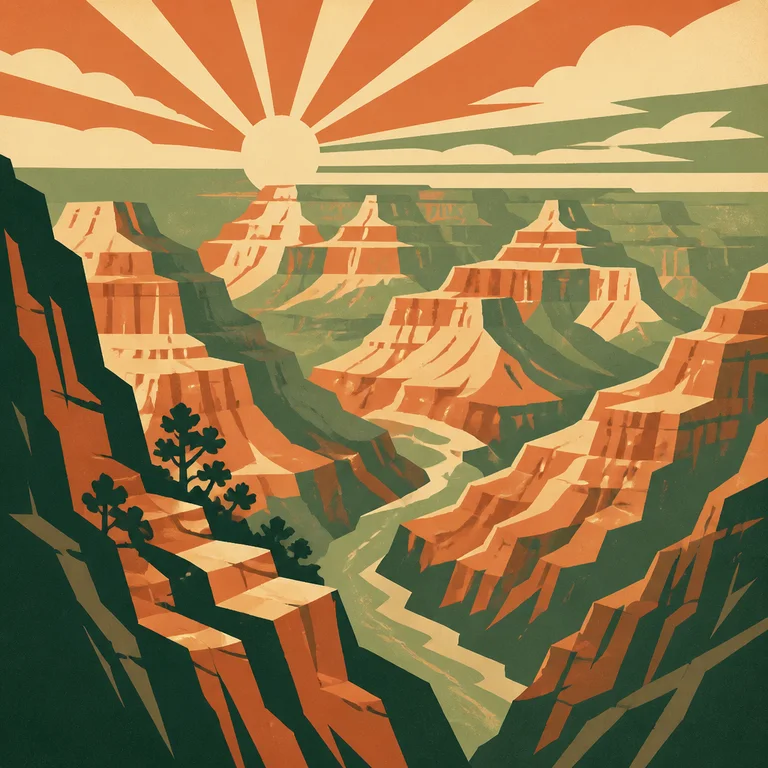
Description
Between 1936 and 1943 the Works Progress Administration's Federal Art Project produced over 2,000 silkscreened posters to promote national parks, public health, theater, and civic life. Only about 900 survive — and they remain the canonical reference for the "American travel poster" look. Visual rules: flat opaque silkscreen inks in 4–6 colors per poster; bold geometric stylization (a mountain becomes a series of triangles, a cloud becomes a stepped shape); generous, simple compositions with a single dominant subject and large readable typography; warm earth-tone palettes (terracotta, mustard, sage, navy, cream) reflecting Depression-era pigment availability; custom hand-lettered display typography integrated into the lower third; explicit civic optimism in subject matter — parks, monuments, public works. Use it for national-park-style imagery, civic and tourism marketing, period editorial about the 1930s–40s, retro travel branding, and any image that should feel proudly American and hand-crafted. Generative models default to either generic "vintage travel poster" or art deco overshoot. Specify "WPA Federal Art Project poster, 4-color silkscreen, geometric stylization of landscape, warm earth-tone palette of terracotta sage and cream, custom hand-lettered display typography in lower third, Grand Canyon or Yellowstone style."
Three pioneers
Every style in this catalog names three verifiable pioneers. This is the part of the drop test that takes the longest to write and is the easiest to spot when it's missing.
-
Federal Art Project (Holger Cahill, director)
WPA program 1935–1943. Employed over 5,000 artists nationally. Cahill (1887–1960) was the federal director and the institutional architect of the program. The posters themselves were collective output, mostly anonymous.
-
Chet Smolski / Chester Smolski (and the Illinois WPA studio)
Representative of the regional WPA poster studios — Illinois, California, Pennsylvania — that produced most of the surviving posters. The Illinois studio under Charles Verschuuren produced the largest single body of work.
-
Stanley Thomas Clough
American designer who produced some of the most reproduced national-park WPA posters (Grand Canyon, Wind Cave). Worked through the WPA's California and regional studios. His designs anchor most contemporary reissues.
Contemporary revival
The National Park Service's Centennial WPA-reissue program (2016) and Ranger Doug Leen's See America project, plus the continuous use of WPA-style imagery in contemporary tourism, brewery branding, and the 'See America' Creative Action Network campaign (2013–present)
Ranger Doug Leen (Yellowstone) has produced WPA-style posters since the 1970s; his prints are sold in every major national park visitor center and have funded park preservation. The Creative Action Network's See America initiative published 75+ new WPA-style posters (2013–) and was covered by NPR, The Atlantic, and Smithsonian. National Park Service centennial merchandise (2016) leaned heavily on the WPA visual language. #wpaposter on Instagram exceeds 60K posts; the style is essentially the default for craft-brewery and outdoor-brand graphics.
Working prompts
Three prompts we've tested against current FairStack models. Copy and run.
-
WPA Federal Art Project travel poster, geometric stylized view of Grand Canyon at sunrise, 4-color silkscreen in terracotta sage and cream, custom hand-lettered display typography reading GRAND CANYON NATIONAL PARK in lower third, flat opaque inks
-
1930s national park poster, stylized bison silhouette against geometric mountains, mustard and navy palette, civic-optimist composition, hand-drawn type
-
Depression-era public-health WPA poster, single bold geometric illustration, flat 5-color silkscreen, warm cream paper, civic message in custom serif type at bottom
Recommended models
Models from FairStack's catalog that handle this style best. Sorted by price.
Related styles
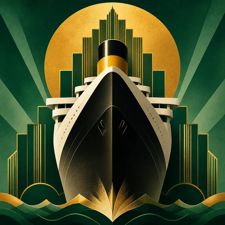
Art Deco Poster
Art Deco poster design — roughly 1910 to 1940, peaking in Paris between the 1925 Exposition Internationale and the early 1930s — has a vi…
Open style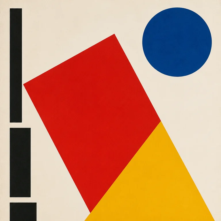
Bauhaus
The Bauhaus school operated for fourteen years (1919–1933) in three German cities before the Nazis shut it down — but the visual grammar…
Open style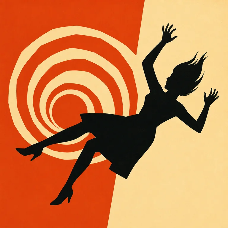
Saul Bass Title Card
Saul Bass (1920–1996) redefined what film title sequences could be — he made them part of the film, not a list of names to skip — and the…
Open style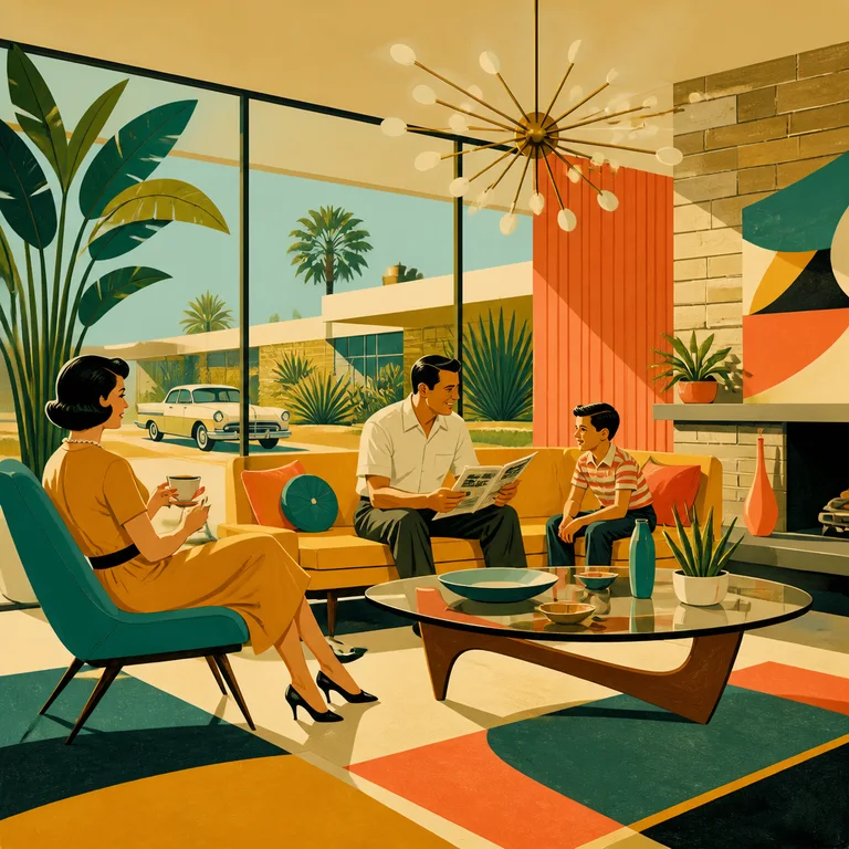
1950s Mid-Century Modern
Mid-century modern is the visual language of postwar American optimism, roughly 1947 to 1965, born in California, Scandinavia, and Italy…
Open style