Description
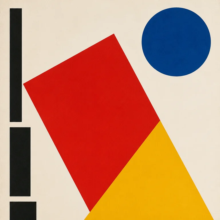
The Bauhaus school operated for fourteen years (1919–1933) in three German cities before the Nazis shut it down — but the visual grammar it produced is the foundation of modern graphic design. The rules are simple and severe. Primary colors only — red, yellow, blue — plus black and white; geometric primitives — circle, square, triangle — used as both compositional and figural elements; sans-serif typography, often custom-drawn, aligned to grids and rotated to 90° or 45°; no ornament; no perspective; explicit reference to printing and mechanical reproduction. Compositions are diagonal and dynamic, not symmetric — the asymmetric balance is a Bauhaus signature. Use it for poster design, brand identity work in modern/architectural sectors, editorial layouts, exhibition design, and anything that should communicate rigor, modernism, or design-school credibility. It does not do warmth, photoreal, ornament, or anything pre-industrial. Generative models will give you "primary colors and shapes" mush if you don't specify the typographic logic. Ask for "Bauhaus design, primary red yellow blue plus black on white, geometric primitives in asymmetric diagonal composition, custom sans-serif typography aligned to grid, no ornament, Moholy-Nagy or Herbert Bayer school."
Three pioneers
Every style in this catalog names three verifiable pioneers. This is the part of the drop test that takes the longest to write and is the easiest to spot when it's missing.
-
László Moholy-Nagy
Hungarian artist and Bauhaus master 1923–1928. Defined the photographic and constructivist side of the Bauhaus visual language. His New Vision (1932) made the case for design as a marriage of geometry and industry.
-
Herbert Bayer
Austrian designer and Bauhaus student-then-master. Designed the universal sans-serif typeface (1925) — all-lowercase, geometric — and the iconic Bauhaus posters and exhibition catalogs. Set the template for modern graphic design education.
-
Wassily Kandinsky
Russian painter and Bauhaus master 1922–1933. His theoretical work Point and Line to Plane (1926) codified the relationship between primary colors and primary shapes — yellow triangle, red square, blue circle — that became the Bauhaus visual axiom.
Contemporary revival
The Bauhaus centenary (2019) and the wave of bauhaus-school institution programming and merchandising, plus continuous mainstream design education and brand-identity usage (Apple's grid-based identities, Pentagram's persistent Bauhaus references)
The Bauhaus 100 program in 2019 produced major exhibitions at the Bauhaus-Archiv Berlin (reopened 2022), the Vitra Design Museum, and MoMA. Phaidon's Bauhausbücher reissue (2019–2021) sold out multiple editions. The TASCHEN Bauhaus complete works has been in print continuously and is one of the publisher's bestsellers. #bauhaus on Instagram exceeds 2.5M posts. Every introductory graphic-design syllabus in the world includes Bauhaus as a unit; it remains one of the highest-volume design-history search terms.
Working prompts
Three prompts we've tested against current FairStack models. Copy and run.
-
Bauhaus-style poster, asymmetric diagonal composition of red square and yellow triangle on white background, blue circle in upper right, black sans-serif German typography rotated 90 degrees on left edge, no ornament, 1925 print aesthetic
-
Herbert Bayer-style typographic poster, all-lowercase geometric sans-serif, primary red and blue blocks, white background, 1920s German exhibition poster
-
Bauhaus geometric composition, intersecting circle square and triangle in primary red yellow blue on white, black grid lines, mechanical reproduction look, Moholy-Nagy influence
Recommended models
Models from FairStack's catalog that handle this style best. Sorted by price.
Related styles
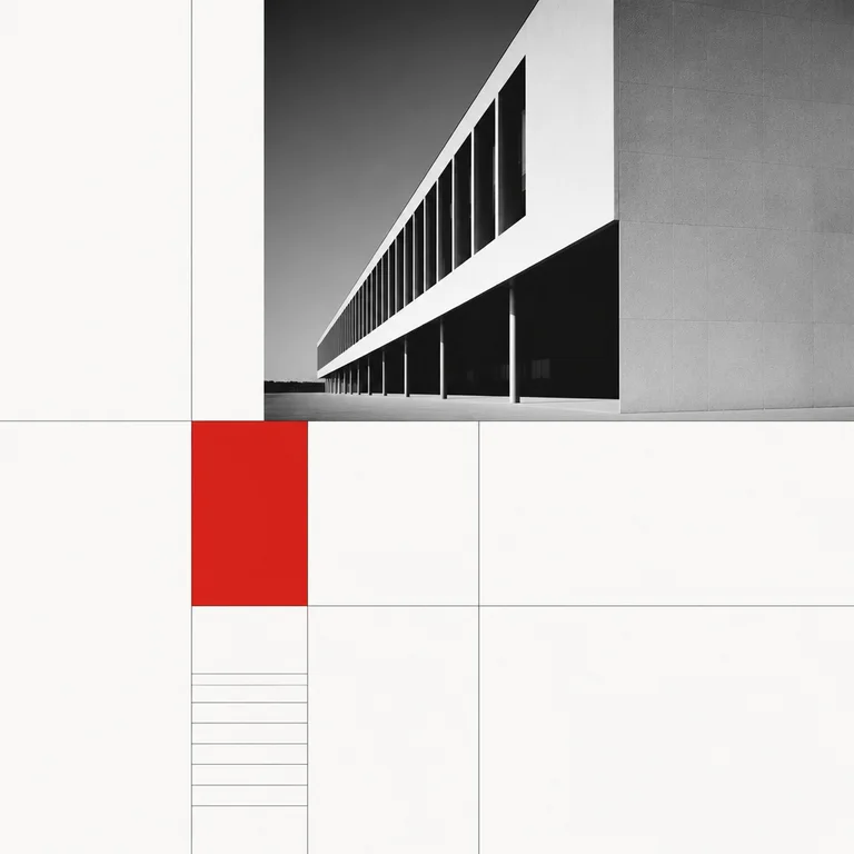
Swiss International Typographic
The Swiss / International Typographic Style emerged in Zurich and Basel in the late 1940s and dominated corporate and editorial design fr…
Open style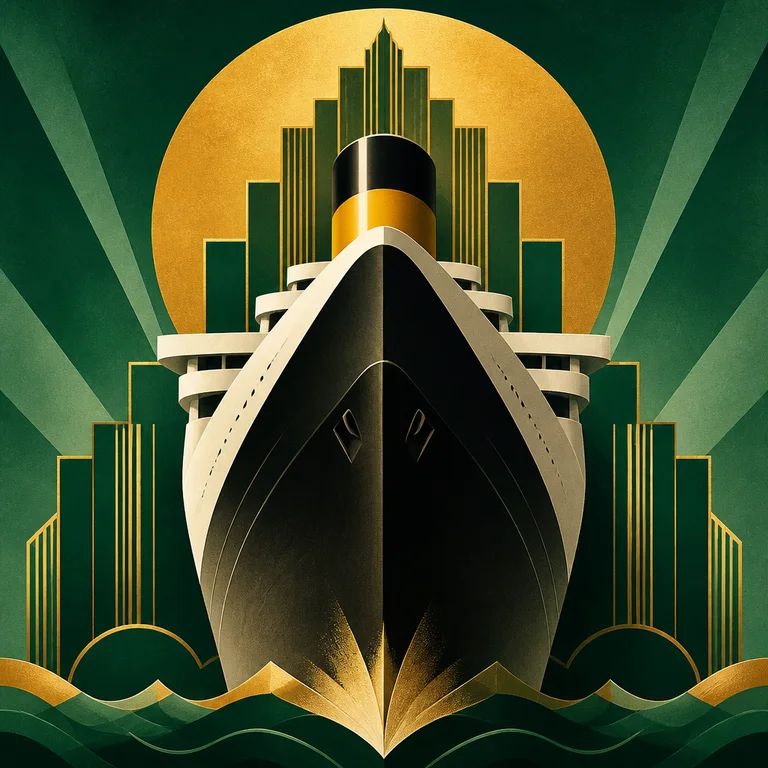
Art Deco Poster
Art Deco poster design — roughly 1910 to 1940, peaking in Paris between the 1925 Exposition Internationale and the early 1930s — has a vi…
Open style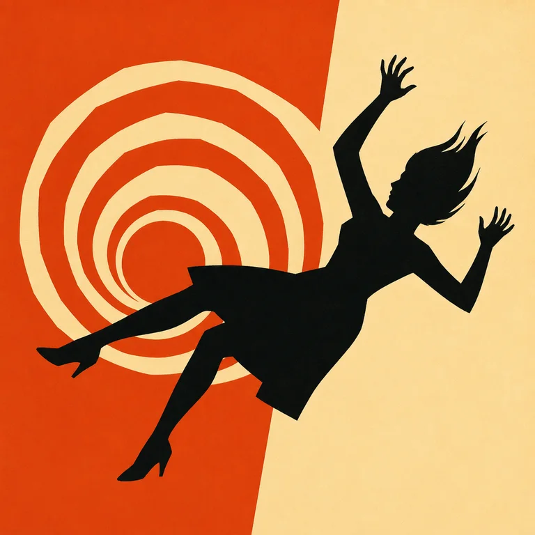
Saul Bass Title Card
Saul Bass (1920–1996) redefined what film title sequences could be — he made them part of the film, not a list of names to skip — and the…
Open style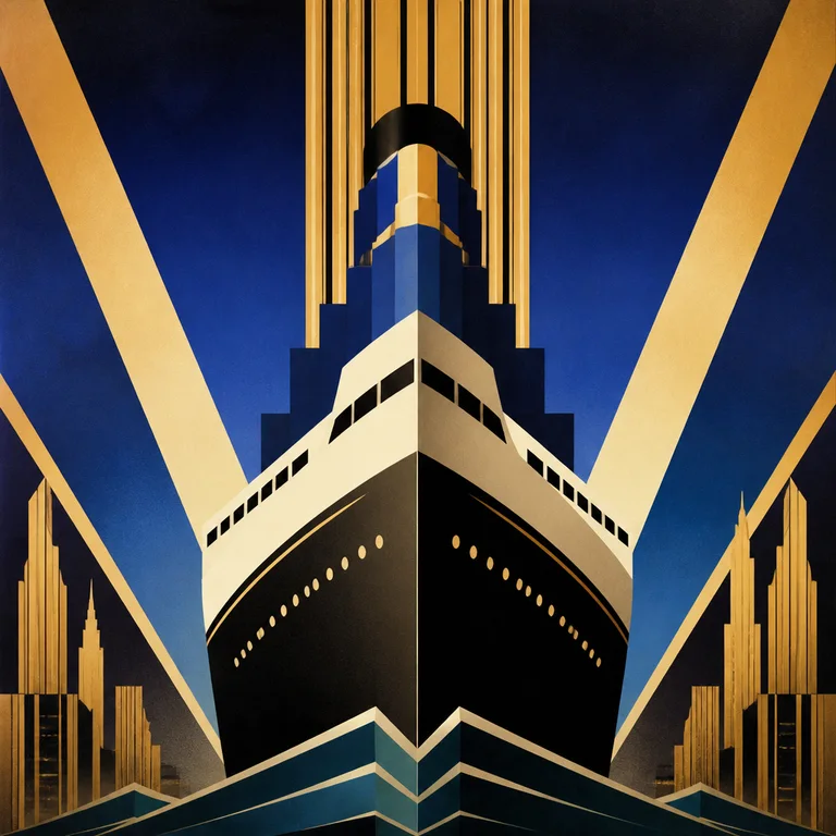
1920s Art Deco
Art Deco was the dominant decorative style from roughly 1920 to 1939, born at the 1925 Paris Exposition Internationale des Arts Décoratif…
Open style