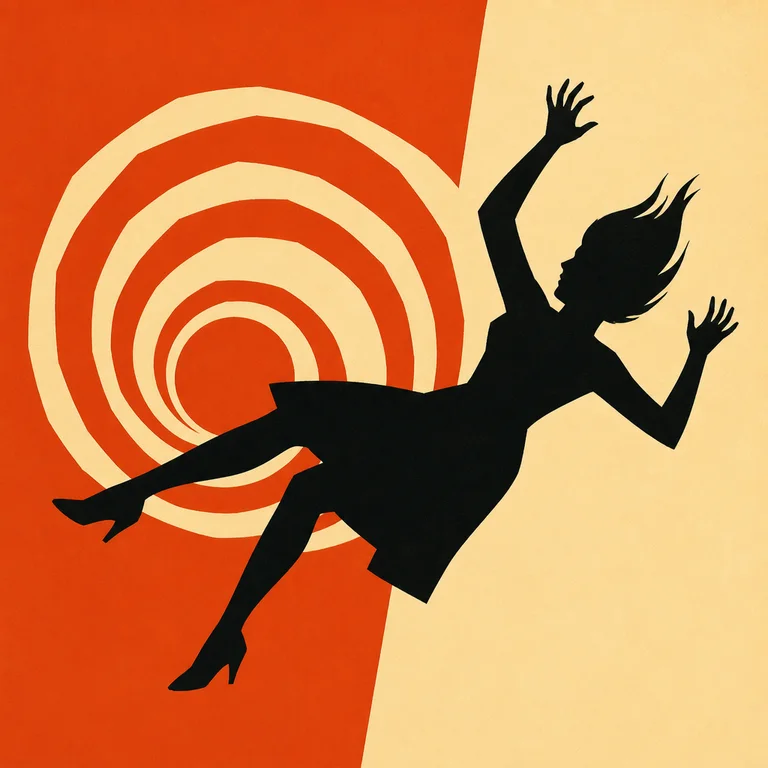
Description
Saul Bass (1920–1996) redefined what film title sequences could be — he made them part of the film, not a list of names to skip — and the same approach defined his poster work for Vertigo, Anatomy of a Murder, The Man with the Golden Arm, and West Side Story. The visual rules are tight and have not aged. Cut-paper shapes in flat solid color, no gradients; a small number of colors per design, usually two or three; a single bold symbolic shape that compresses the film's emotional content (the falling spiral for Vertigo, the cut-out arm for Golden Arm, the Bonwit-Teller torn paper for Anatomy of a Murder); strong simplified figure-ground compositions with a clear focal hit; hand-drawn or hand-lettered typography integrated into the same plane as the imagery. Use it for film and event posters, book covers, brand identity work that wants to feel 1950s-modern, opening-title-style hero images, and any composition that should communicate one idea quickly. Limitations: not for photoreal, not for detail, not for soft. Specify "Saul Bass style, cut-paper flat solid color, single bold symbolic shape, two-color or three-color palette, hand-lettered serif typography integrated."
Three pioneers
Every style in this catalog names three verifiable pioneers. This is the part of the drop test that takes the longest to write and is the easiest to spot when it's missing.
-
Saul Bass
American graphic designer. Designed title sequences for Hitchcock (Vertigo 1958, North by Northwest 1959, Psycho 1960), Preminger (The Man with the Golden Arm 1955, Anatomy of a Murder 1959), and later Scorsese. Also designed corporate identities including AT&T and Continental Airlines.
-
Elaine Bass
Saul's wife and creative partner from 1960 onward. Co-credited on most of the later film title work including Goodfellas (1990), Cape Fear (1991), and Casino (1995).
-
Paul Rand
Contemporary American designer. Identity work for IBM (1956), UPS (1961), Westinghouse (1960). Sits alongside Bass as the other defining American mid-century graphic designer.
Contemporary revival
Sustained homage in contemporary title-design and poster work — including Catch Me If You Can (2002), Mad Men (2007), The Marvelous Mrs. Maisel (2017), and dozens of Criterion Collection re-releases
The Catch Me If You Can title sequence by Olivier Kuntzel and Florence Deygas, an explicit Bass homage, was nominated for an Annie Award. Mad Men's title sequence (Imaginary Forces) is also a direct Bass nod. The Criterion Collection has commissioned Bass-style covers for dozens of Hitchcock and Preminger re-releases.
Working prompts
Three prompts we've tested against current FairStack models. Copy and run.
-
Saul Bass style film poster, single bold cut-paper black silhouette of woman falling, set against orange and cream split background, hand-lettered serif title reading VERTIGO, two-color, flat solid
-
Bass-style title card, abstract cut-paper geometric arm-and-hand shape in black on yellow background, no gradients, hand-lettered typography
-
Saul Bass corporate identity sketch, simplified bird silhouette in three flat colors, white background, geometric integration of symbol and wordmark
Recommended models
Models from FairStack's catalog that handle this style best. Sorted by price.
Related styles
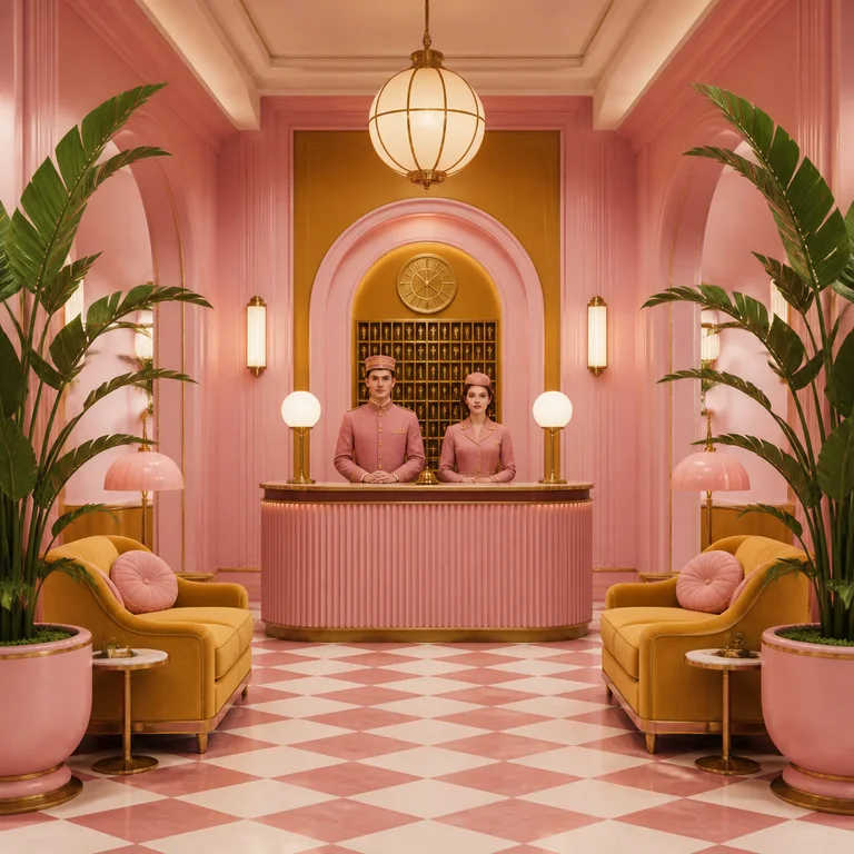
Wes Anderson Symmetric
Wes Anderson's visual language is the most imitated in contemporary cinema for a reason: it is rule-based and easy to identify. The rules…
Open style
Risograph
Risograph is a Japanese stencil-duplication printing technology (Riso Kagaku, since 1986) that was originally designed for cheap school n…
Open style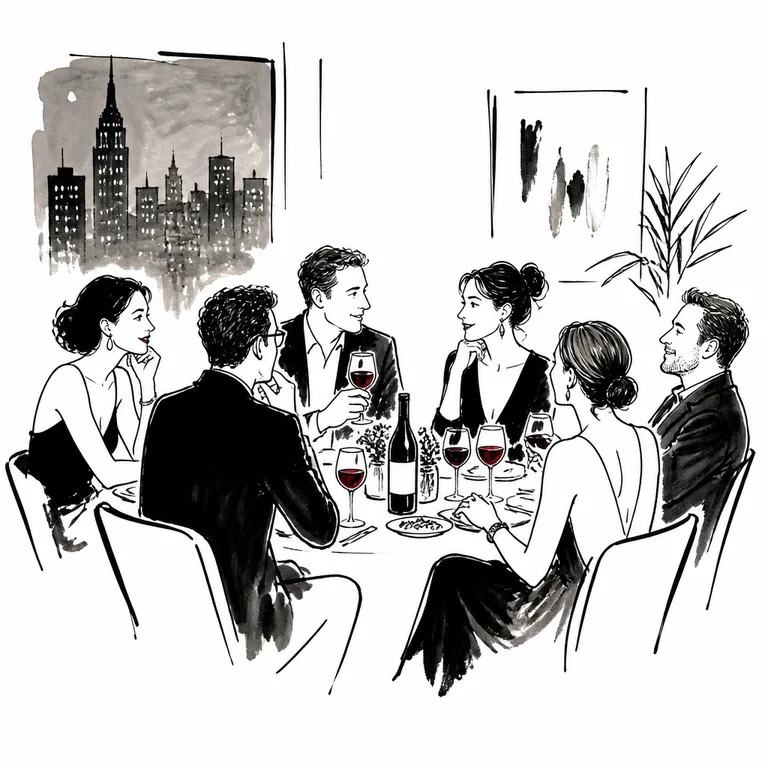
New Yorker Editorial Ink
The New Yorker has run editorial illustration and cartoons in a coherent visual language for nearly a century. The style is not one artis…
Open style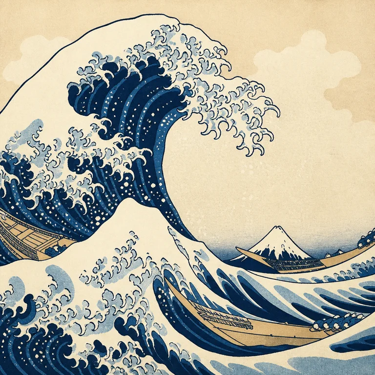
Ukiyo-e Woodblock
Ukiyo-e — "pictures of the floating world" — is the dominant Japanese print tradition from roughly 1660 to 1900. The images were carved i…
Open style