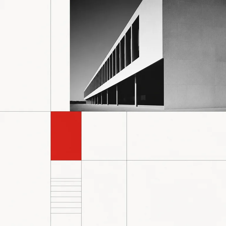
Description
The Swiss / International Typographic Style emerged in Zurich and Basel in the late 1940s and dominated corporate and editorial design from roughly 1950 to 1980. It remains the dominant visual idiom of contemporary technology and corporate identity work — Apple, Google, Spotify, and most modern brand systems are direct descendants. Rules are strict. Sans-serif typography only — Helvetica (1957), Univers (1957), Akzidenz-Grotesk; flush-left, ragged-right setting; an underlying mathematical grid that determines every element's position; objective photography rather than illustration; large areas of white space; minimal color, often one accent on a neutral ground; modular layouts that scale across formats; total absence of ornament. Use it for corporate identity, editorial, modern poster design, exhibition graphics, wayfinding signage, and any composition that should read as authoritative, rational, and contemporary. Limitations: not for warmth, decoration, illustration, or anything pre-industrial. Models will produce vague "minimalist" output. Specify "Swiss International Typographic Style, Helvetica or Univers, flush-left ragged-right setting, mathematical grid, objective black-and-white photography, single red accent, generous white space, Müller-Brockmann school."
Three pioneers
Every style in this catalog names three verifiable pioneers. This is the part of the drop test that takes the longest to write and is the easiest to spot when it's missing.
-
Josef Müller-Brockmann
Swiss designer, 1914–1996. Grid Systems in Graphic Design (1981) is the foundational textbook for the style. His Zurich Tonhalle concert posters (1950s) are the canonical examples.
-
Max Bill
Swiss architect and designer, 1908–1994. A direct Bauhaus alumnus who carried the modernist project forward; co-founded the Hochschule für Gestaltung Ulm in 1953, which trained the next generation.
-
Armin Hofmann
Swiss designer, 1920–2020. Taught at Basel School of Design for 40+ years; his Graphic Design Manual (1965) and his Stadttheater Basel posters defined the high-contrast photographic / typographic Swiss approach.
Contemporary revival
Apple's brand and product design since the late 1990s, Spotify's identity system, the persistent dominance of Helvetica in tech and corporate identity, and the cyclical resurgence of 'Swiss design' poster trends (most recently 2020–present)
Helvetica's 50th anniversary documentary (Gary Hustwit, 2007) is still the most-watched design documentary of all time. Apple's switch to San Francisco (2014) was widely covered as 'a Swiss-typography-school decision.' #swissdesign on Instagram exceeds 600K posts; #helvetica exceeds 1.2M. Müller-Brockmann's Grid Systems has stayed continuously in print since 1981 and sells thousands of copies annually. Every Y Combinator startup's pitch deck is essentially this style.
Working prompts
Three prompts we've tested against current FairStack models. Copy and run.
-
Swiss International Typographic Style poster, flush-left Helvetica typography on mathematical grid, large white space, single objective black-and-white photograph in upper third, single red accent block, Müller-Brockmann school
-
Swiss-style editorial layout, three-column mathematical grid, sans-serif body text flush-left ragged-right, geometric chart in lower half, generous margins, no ornament
-
1960s Zurich concert poster, large Akzidenz-Grotesk type rotated 90 degrees, single circle in red, black-and-white objective photograph, modular grid composition
Recommended models
Models from FairStack's catalog that handle this style best. Sorted by price.
Related styles
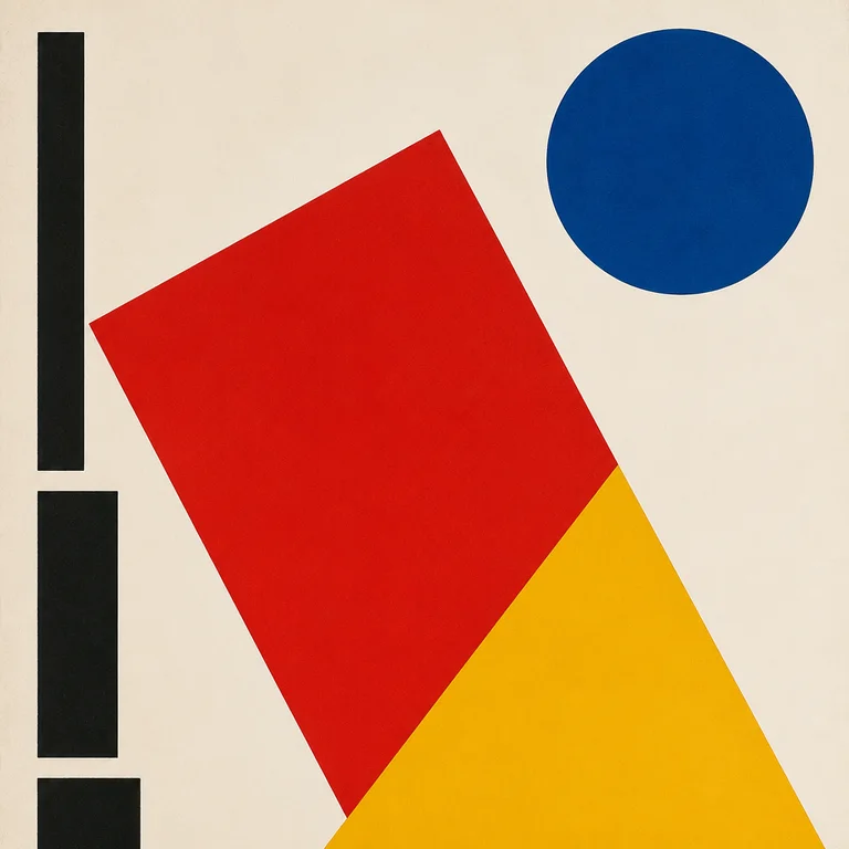
Bauhaus
The Bauhaus school operated for fourteen years (1919–1933) in three German cities before the Nazis shut it down — but the visual grammar…
Open style
Saul Bass Title Card
Saul Bass (1920–1996) redefined what film title sequences could be — he made them part of the film, not a list of names to skip — and the…
Open style
Art Deco Poster
Art Deco poster design — roughly 1910 to 1940, peaking in Paris between the 1925 Exposition Internationale and the early 1930s — has a vi…
Open style
WPA Travel Poster
Between 1936 and 1943 the Works Progress Administration's Federal Art Project produced over 2,000 silkscreened posters to promote nationa…
Open style