Description
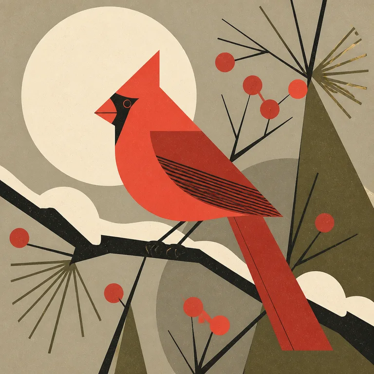
Mid-Century Graphic Illustration is the flat, witty, geometry-driven American commercial illustration of roughly 1948–1965 — the look of jazz album covers, modernist book jackets, and Ford Times nature spreads. It must not be confused with mary-blair-mid-century: Mary Blair's strand is Disney concept and animation production art (gouache, theatrical colour, narrative scenes for film). This is the parallel graphic-design strand — editorial, packaging, and record-sleeve illustration built from cut-shape geometry, not painted scenery. Visual rules: extreme reduction — a subject distilled to the fewest possible flat shapes ("minimal realism," Charley Harper's own term); geometric construction with hard edges, circles, triangles, and clean negative space; a limited, deliberately offbeat mid-century palette (mustard, teal, coral, olive, warm grey); flat colour with no rendering or gradient; playful, sometimes jittery linear energy and pattern (Jim Flora's surreal, rubbery musicians); integration with typography as an equal element; texture only as flat screen-print grain, never as illusionistic shading; humour and concept over realism. Use it for album and book covers, branding and packaging, editorial illustration, posters, and any image that wants a confident, intelligent, handmade-modernist read. It does not do depth, atmosphere, soft light, or rendered realism — it is shape, colour, and idea on a flat plane. Models default to generic flat vector. Specify "mid-century graphic illustration, subject reduced to minimal flat geometric shapes, offbeat mid-century palette, hard edges and clean negative space, flat screen-print grain only, integrated typography, Charley Harper or Jim Flora lineage."
Three pioneers
Every style in this catalog names three verifiable pioneers. This is the part of the drop test that takes the longest to write and is the easiest to spot when it's missing.
-
Charley Harper
American illustrator, 1922–2007. Coined 'minimal realism'; illustrated Ford Times, the Golden Book of Biology, and the Cincinnati Zoo identity, reducing wildlife to precise flat geometric shapes — the defining nature-graphic strand of the style.
-
Jim Flora
American artist, 1914–1998. Art director and illustrator for RCA Victor and Columbia Records in the late 1940s–1950s; his surreal, rubbery, frantic jazz and mambo album covers are the definitive mid-century record-sleeve illustration.
-
Alvin Lustig
American designer, 1915–1955. His New Directions book jackets used abstract symbolic marks and geometric forms instead of representational scenes — the strand that brought European modernist abstraction into American commercial book illustration.
Contemporary revival
The Charley Harper licensing estate and Todd Oldham monograph, and the broader mid-century-modern resurgence in interiors and homeware
Designer Todd Oldham's career-spanning Charley Harper: An Illustrated Life (AMMO Books, 2007, with multiple subsequent editions and a smaller 'Pop Book') reignited the market and seeded a continuous licensed-product business — Charley Harper Art Studio licenses fabric (notably Birch Fabrics), wallpaper, puzzles, and homeware sold through major retailers. Jim Flora's work was revived by two Fantagraphics monographs (The Mischievous Art of Jim Flora, 2004; The Curiously Sinister Art of Jim Flora, 2007) and is a standing reference in record-sleeve and music-graphics culture. The wider mid-century-modern revival is one of the most durable interiors and design categories of the past two decades — sustained by Herman Miller / Eames reissues, the Palm Springs Modernism Week (drawing tens of thousands annually), and a permanent #midcenturymodern presence on Pinterest and Instagram that keeps the graphic strand in active commercial demand.
Working prompts
Three prompts we've tested against current FairStack models. Copy and run.
-
Mid-century graphic illustration of a cardinal on a snowy branch reduced to minimal flat geometric shapes, hard edges and circles and triangles, offbeat palette of coral and warm grey and olive, clean negative space, flat screen-print grain only, no rendering, Charley Harper minimal-realism lineage
-
Jim Flora-style 1950s jazz album cover, surreal rubbery musicians and instruments in frantic geometric arrangement, flat offbeat mid-century colour, jittery linear energy, integrated hand display type
-
Alvin Lustig-style modernist book jacket, abstract symbolic geometric marks instead of a scene, limited mid-century palette, flat colour, typography as an equal element
Recommended models
Models from FairStack's catalog that handle this style best. Sorted by price.
Related styles
Mary Blair Mid-Century
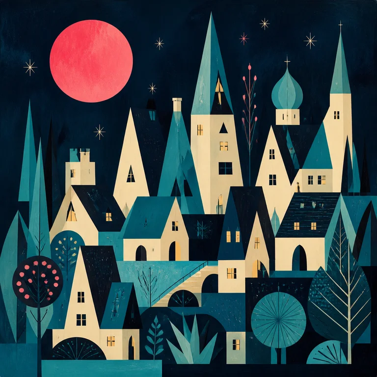
Mary Blair's concept art for Disney between 1940 and 1965 — Cinderella, Alice in Wonderland, Peter Pan, and the It's a Small World ride —…
Open style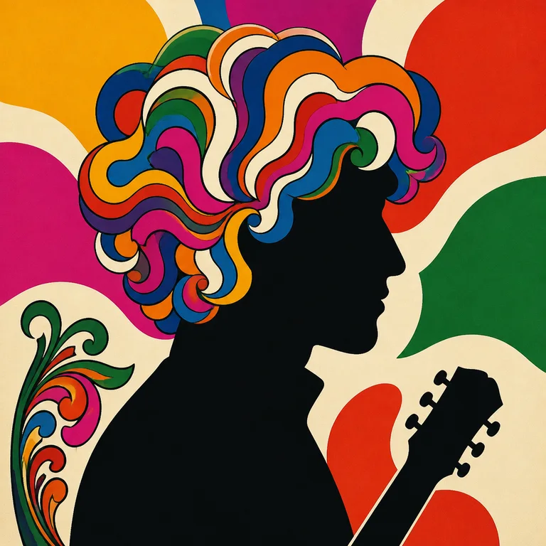
Milton Glaser Pop
Milton Glaser Pop is the warm, eclectic, idea-first American graphic illustration that came out of Push Pin Studios from 1954 onward — th…
Open style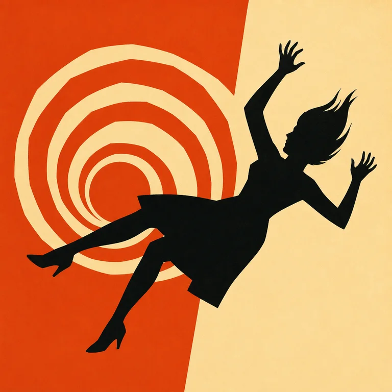
Saul Bass Title Card
Saul Bass (1920–1996) redefined what film title sequences could be — he made them part of the film, not a list of names to skip — and the…
Open style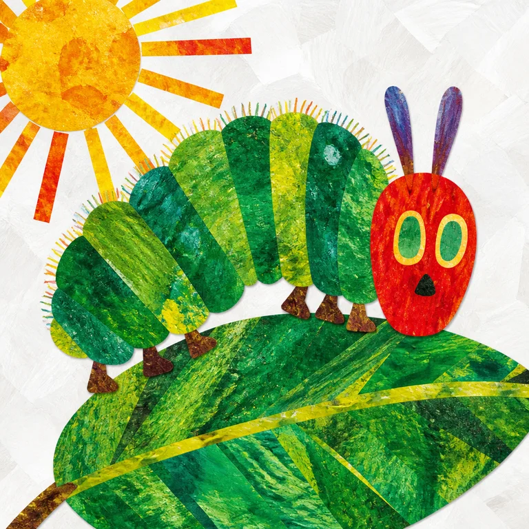
Eric Carle Collage
Eric Carle's method was specific and physical: he painted large sheets of tissue paper by hand with acrylics — splatters, brushwork, fing…
Open style